Project Description
Step to School
Introduction
Students should be able to reach a school bus stop within a reasonable walking time (10–15 minutes). This supports active travel and reduces reliance on cars. While transport planning often uses 400 m (5–10 minutes) as a benchmark for general buses, for school services we considered up to 1 km (15 minutes) as an upper limit.
Methodology
The analysis was designed to capture both the demand side (where students live) and the supply side (where buses stop), and to measure them with realistic walking distances. The main steps were:
Student home locations were represented by SA1 centroids.
Each SA1 (Statistical Area 1) represents about 200–800 people. Using centroids provides a privacy-preserving but still spatially accurate way of modelling where students come from. For each SA1–school pair, a centroid was taken as the “home location”.
School-special bus routes were matched to schools using fuzzy name matching
Many bus routes have names or headsigns like “to St Mary’s” or “via Amaroo”. By applying text similarity scoring (rapidfuzz library), these routes were linked to the correct school in the dataset. This ensures we only considered stops that genuinely serve a given school.
A walking network was built from OpenStreetMap to calculate realistic paths
OpenStreetMap data was used to construct a pedestrian network graph with streets, footpaths and crossings. Each edge in the graph was weighted by travel time, using a walking speed of about 1.4 m/s. This avoided straight-line distortions where barriers like highways, rivers or cul-de-sacs would otherwise be ignored.
Snapping student and stop locations to the network
Both SA1 centroids and bus stops were “snapped” to the nearest node in the walking graph, ensuring calculations followed real walkable routes.
For each SA1–school pair, we measured the minimum walking time to the nearest stop that serves that school
Using Dijkstra’s algorithm, the minimum path length from each student location to any valid stop for their school was calculated. The result was the actual walk time in minutes.
Results were aggregated to produce coverage statistics at both SA1 and school levels.
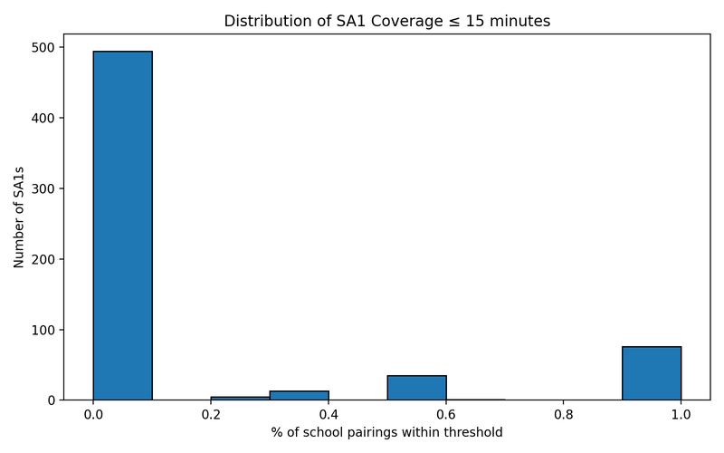
Coverage was defined by two thresholds: 10 minutes (short, comfortable walk) and 15 minutes (upper reasonable limit). At the SA1 level, the percentage of school pairs within each threshold was calculated. At the school level, the percentage of its SA1 catchment areas that were within the thresholds was measured.
A greedy algorithm suggested up to 15 new stops where coverage would improve most
The algorithm worked iteratively: at each step it identified the cluster of students most underserved, placed a hypothetical new stop at the centroid of that cluster, and recalculated coverage. This was repeated up to 15 times. The first few stops gave the largest gains, showing diminishing returns after that.
Results
Baseline Coverage
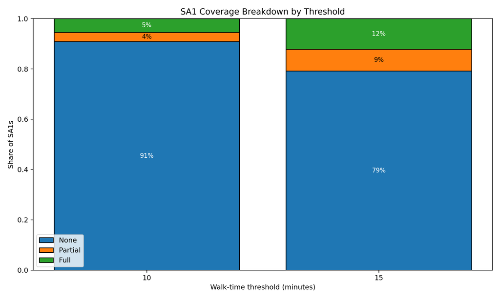
The baseline shows very limited access:
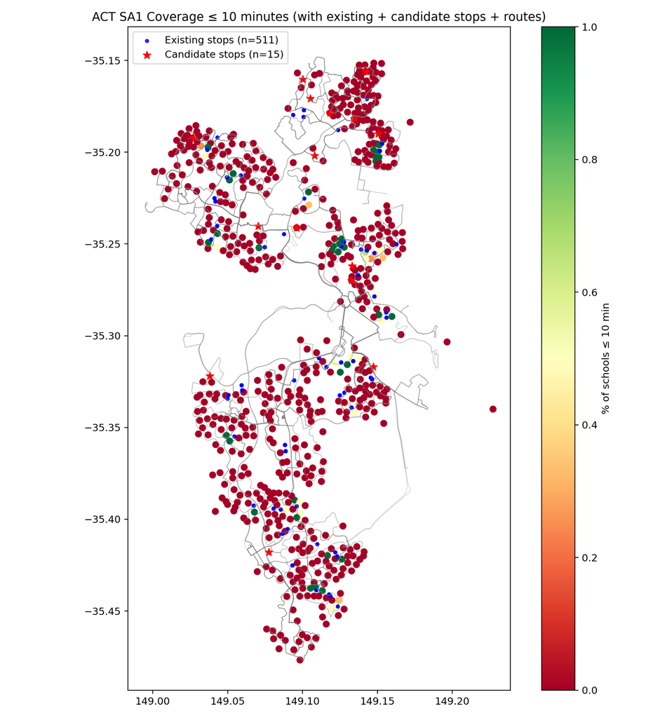
- Within 10 minutes: about 5 percent of SA1–school pairs
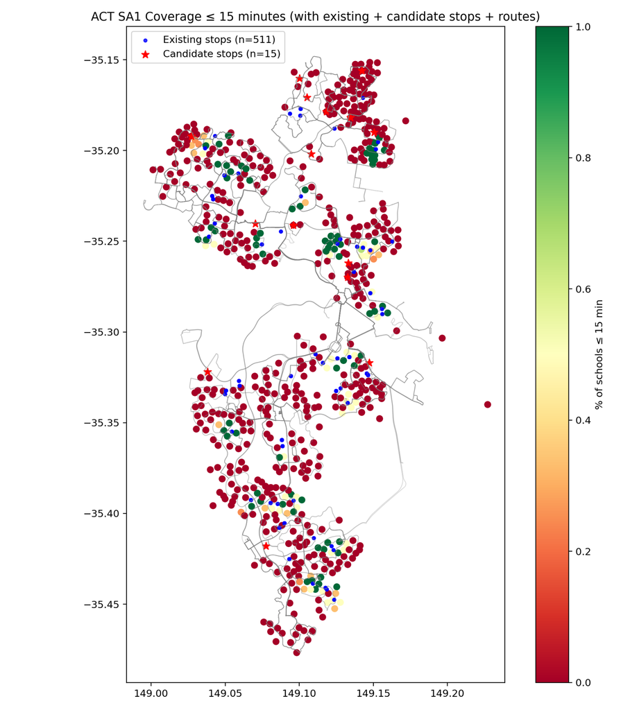
- Within 15 minutes: about 12 percent of pairs
This means the overwhelming majority of students are further than 15 minutes from a dedicated school bus stop.

Maps highlight how much of Canberra falls outside these walk thresholds:


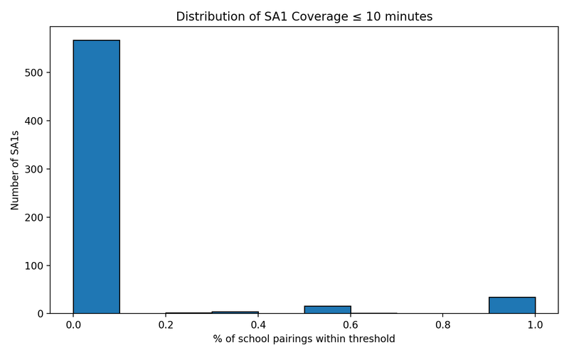
The histograms reinforce this picture: most SA1s have zero or near-zero coverage at both 10 and 15 minutes.


School-Level Disparities
The gap is not evenly spread:
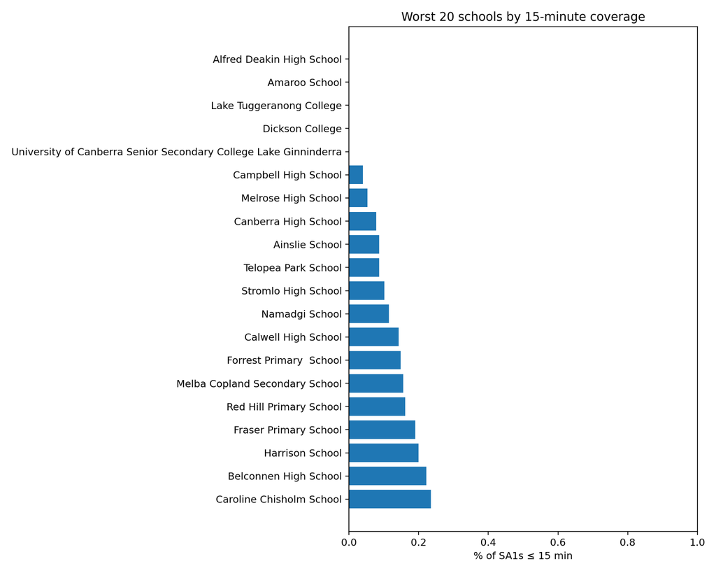
- Several schools have no coverage at all within 15 minutes. These include Amaroo School, Alfred Deakin High, Lake Tuggeranong College, Dickson College, and UC Senior Secondary College.

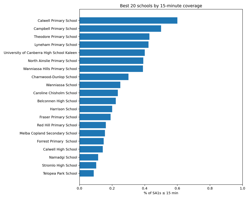
- A few schools do much better. Calwell Primary has about 60 percent of its student areas within 15 minutes of a stop; Campbell, Theodore, Lyneham, and UC Kaleen also perform relatively well.

This shows that some students enjoy good access, but for most schools walking to a bus stop is unrealistic.
Quick Wins: Adding 15 New Stops
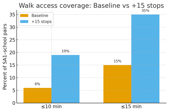
I tested a simple strategy of adding 15 stops in high-need locations. The results were striking:
- 10 minute coverage improves from ~6 percent to ~19 percent
- 15 minute coverage improves from ~15 percent to ~35 percent
This means 2–3 times more students would be within a reasonable walking distance of a bus stop.

These proposed stops are concentrated in outer growth areas like west Belconnen, Gungahlin, Molonglo, and Tuggeranong. They represent quick wins where a single new stop can cover many students.
Comparison with Other Cities (references)
Other Australian cities perform better because students can often rely on the regular network:
Conclusion
- Most Canberra students cannot walk to a school bus stop within 15 minutes.
- Some schools have no walking access at all, while others reach 40–60 percent.
- Adding just 15 stops could more than double walkable access, giving thousands of students a practical option to walk to their bus.
- Compared with other cities, Canberra is far behind, but targeted low-cost fixes could rapidly improve coverage.
Data Story
Data Story
This project combines several ACT open datasets with external mapping data to build a picture of school transport accessibility. Each dataset contributes a piece of the story:
ACT School Bus Services (Transport Canberra)
Provides the list of stops and routes for dedicated school specials. This is the backbone of the analysis — it tells us where students can board a bus to their school.
Students by SA1 and School (Education Directorate)
Generates the SA1–school pairings that form the basis of the walkability analysis. Instead of addresses, students are aggregated to small statistical areas for privacy.
ACT SA1 Centroids (ABS ASGS 2021)
Supplies geographic anchor points for each SA1. These centroids are treated as representative “home locations” for calculating walk times.
OpenStreetMap Pedestrian Network (external)
Adds realistic walking paths, including footpaths and crossings. This allows network analysis to reflect real travel times instead of straight-line buffers.
Note: Other datasets like “Daily Passenger Journeys” and general bus route corridors were reviewed for context but not directly used in the core accessibility analysis.
Together, these datasets move the story from “where are the stops?” to “who can realistically use them?”, and finally to “what improvements would make the system more equitable?”.


